Restart Overview
Restart is a multipurpose but mainly business oriented HTML5 Template, built to serve as a foundation for your web projects. It is based on Twitter Bootstrap (check out BS excellent documentation), the front-end development framework with a steep learning curve that changes the way you develop sites. Restart makes real use of {LESS}. It comes with a style.less file that tries to use all the power of {less} and bootstrap combined. Restart is based on fine typography and large photography. It uses subtle animations & a fresh collapsing header effect.
To use the template you have to be familiar with HTML & CSS. The demo is self-explanatory and you can easily study the HTML files to discover how to customise the templates to your needs. This documentation covers some basics to help you get started... If you are a web developer you are about to boost your development workflow!
Responsive Grid & Main Layout
Restart uses Twitter Bootstrap to build the responsive grid. You should study it if you aren't familiar already. Of course it also uses all of bootstrap to style HTML elements so it is a good idea to study all of bootstrap capabilities.
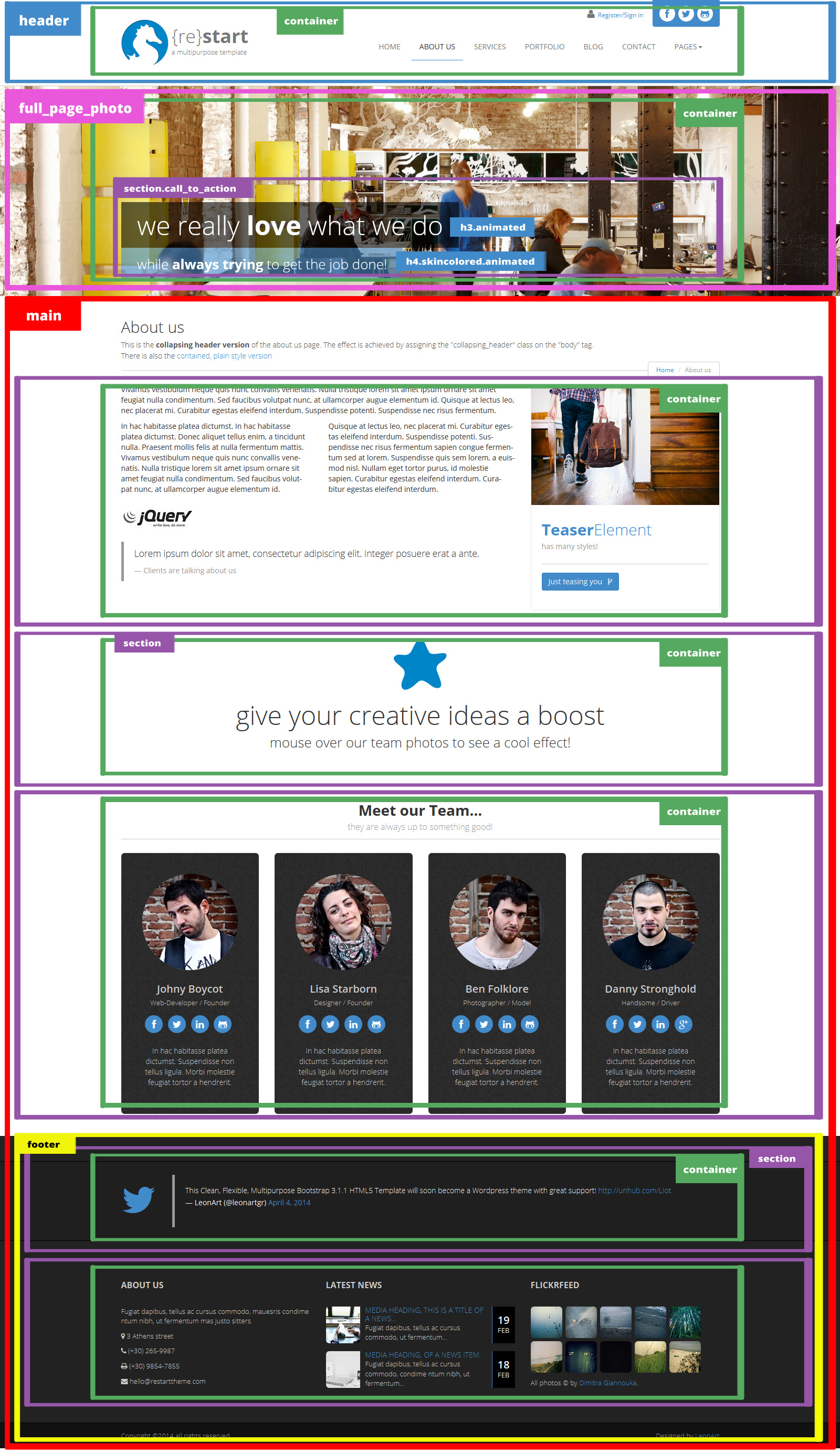
The main layout of the template can be summarized in the next picture:
Less, CSS & Skins
Restart makes heavy use of LESS to style its content but you may as well work with CSS. The files responsible for the styling are in the "twitter-bootstrap" & the "less" folders while the final compiled to CSS stylesheet "style.css" is in the root directory. In "style.less" we import "bootstrap.less", in order to take advantage of its styles, helper classes and mixins, and the "custom_variables.less" which is Bootstrap "variables.less" that we copied and altered in order to override the original variables and make our custom bootstrap skins. This way we leave Bootstrap unharmed.
- less folder
- less/custom_variables.less
- less/style.less
- root folder
- style.css
- animate.css
To change the skin you have to assign the @brand-primary variable to the color of your choise and recompile the styles.less file.
You can use a LESS compiler of your choise. We use Crunch.
Header
Logo Area
The logo area has a width of 315px by default and height of 90px. It has an image, a title and a subtitle. Any one of those can be left out. The image is square by default, 180x180px but it is styled to 90x90px with CSS in order to show better on retina monitors. Of course any settings of those mentioned above can be changed to fit your needs, just search for .navbar-brand at style.less or style.css
Social Area & Fontawsome Icons
The social area icons are Fontawsome Icons. Replace fa-facebook in the following example with the icon-class you like!
<a href="https://www.facebook.com">
	<i class="fa fa-facebook"></i>
</a>
There is the capability to add a top-toolbar in the header. An example is the Contact page.
Flexslider
The Flexslider is presented at the Homepage and the Portfolio Item pages and is powered by jQuery FlexSlider v2.0. The HTML markup to create the slider is the following:
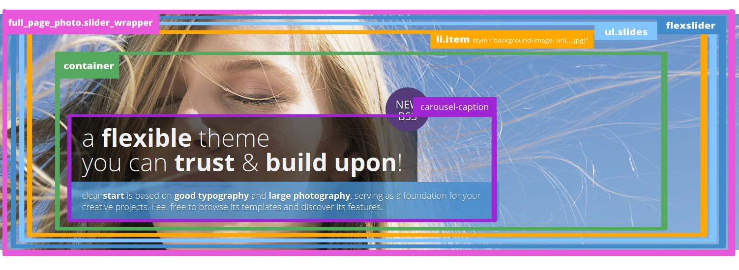
<section id="slider_wrapper" class="slider_wrapper full_page_photo">
<div id="main_flexslider" class="flexslider">
<ul class="slides">
<li class="item" style="background-image: url(images/4.jpg)">
<div class="container">
<div class="carousel-caption">
<h1>a <strong>flexible</strong> theme<br>
you can <strong>trust</strong> & <strong>build upon</strong>!</h1>
<p class="lead skincolored">clean<strong>start</strong> is based on <strong>good typography</strong> and <strong>large photography</strong>, serving as a foundation for your creative projects. Feel free to browse its templates and discover its features.</p> </div>
</li>
<li class="item" style="background-image: url(images/5.jpg)">
...
</li>
<li class="item" style="background-image: url(images/6.jpg)">
...
</li>
<li class="item" style="background-image: url(images/7.jpg)">
...
</li>
</ul>
</div>
</section>
The initialization & settings can be found at js/restart_theme.js
The photos are put as backgound-image and styled as background:cover in order to always fit optimaly in the space provided. You can change the height of the slider_wrapper to fit your needs while 480px is the default.
In every slide there is the carousel-caption that consists of a large title h1 and a small subtitle p.lead. You can style those to black background (by default) or skin-color background by assigning the skincolored class.
<div class="carousel-caption">
<h1>a <strong>flexible</strong> theme<br> you can <strong>trust</strong> & <strong>build upon</strong>!</h1>
<p class="lead skincolored">clean<strong>start</strong> is based on <strong>good typography</strong> and <strong>large photography</strong>, serving as a foundation for your creative projects. Feel free to browse its templates and discover its features.</p> </div>
Full Page Photo & Collapsing-Header Effect
The full-page photo has a height of 400px by default and the actual photo is put as backgound-image and styled as background:cover in order to always fit optimaly in the space provided. There is also a call_to_action section consisting of a h3 and a h4 which are animated and have a black-alpha background by default. This can be changed to skin-color alpha just by adding the skincolored class to either one of them.
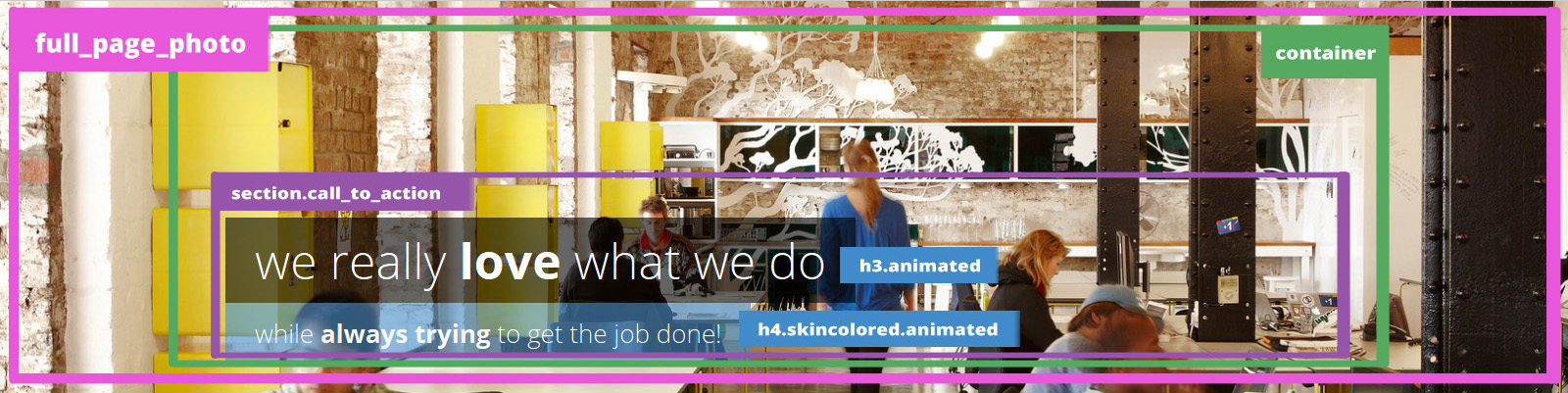
<div class="full_page_photo" style="background-image: url(images/about_us.jpg);">
     <div class="container">
          <section class="call_to_action">
               <h3 class="animated bounceInDown">we really <strong>love</strong> what we do</h3>
               <h4 class="animated bounceInUp skincolored">while <strong>always trying</strong> to get the job done!</h4>
          </section>
     </div>
</div>
Collapsing Header Effect
You probably already noticed the cool scrolling effect on most pages where the header is sticky as you scroll-down and collapses when the full-page photo gets covered. I call it "The collapsing header effect" and can be achieved by assigning the collapsing_header class on the body tag.
<body class="collapsing_header">
Portfolio, Gallery & Isotope Filter
The Portfolio Page uses the Isotope v1.5.25 jQuery plugin to filter the portfolio items according to their categories. The section has a class of portfolio_strict that styles all the portfolio items to a certain 320px height.
To create the row with the filters:
<ul class="portfolio_filters">
	<li><a href="#" data-filter="*">show all</a></li>
	<li><a href="#" data-filter=".cat_artists">artists</a></li>
	<li><a href="#" data-filter=".cat_people">people</a></li>
	<li><a href="#" data-filter=".cat_travel">travel</a></li>
	<li><a href="#" data-filter=".cat_poetic">poetic</a></li>
</ul>
Every portfolio item must have a coresponding class in order to respond to the filtering.
<div class="cat_travel col-xs-12 col-sm-6 col-md-4 col-lg-4">
	<div class="portfolio_item">
		<a href="portfolio_item.html" data-path-hover="M 180,190 0,158 0,0 180,0 z">
			<figure style="background-image:url(images/portfolio/t5.jpg)">
				<svg viewBox="0 0 180 320" preserveAspectRatio="none"><path d="M 180,0 0,0 0,0 180,0 z"/></svg>
				<figcaption>
					<p>Description of the project dapibus, tellus ac cursus commodo, mauesris condime ntum nibh, ut fermentum....</p>
					<button>View</button>
				</figcaption>
			</figure>
		</a>
	<div class="portfolio_description">
		<h3><a href="portfolio_item.html">Lorem Ipsum</a></h3>
		<p>travel</p>
	</div>
	</div>
</div>
The Masonry Gallery Page uses the Masonry layout mode of Isotope v1.5.25 jQuery plugin to arrange the portfolio items according to their dimensions. The section has a class of portfolio_masonry which does not restrict the <div class="portfolio_item"> height.
Styled Elements "Shortcodes"
There are some groups of HTML elements which have a default styling but this styling can be changed just by adding some classes.
For example the section_header has a default styling but accepts elegant, fancy, skincolored and centered classes. The basic markup is:
<h2 class="section_header"><b>Default</b>header<small>and its descrition</small></h2>
Defaultheaderand its descrition
<h2 class="section_header elegant"><b>Elegant</b>header<small>and its descrition</small></h2>
Elegantheaderand its descrition
<h2 class="section_header fancy centered"><b>Fancy</b>centered<small>and its descrition</small></h2>
Fancycenteredand its descrition
You can see more examples at the Services & the Design Elements page.
Footer & Contact Page
The FLICKR widget settings that appears in the footer can be found in js/restart_theme.js
The Contact Page Form works in combination with contact.php file and contact_form.js. Inside contact.php you can find the settings for the form. Of course you have to place the php file to a web server that runs under php 5.2 or newer.
The google map in the contact page uses the Google Maps Api v3 and it will not work as is. It wil show you the following message:
Google has disabled use of the Maps API for this application.
The provided key is not a valid Google API Key, or it is not authorized for the Google Maps
Javascript API v3 on this site. If you are the owner of this application,
you can learn about obtaining a valid key here:
https://developers.google.com/maps/documentation/javascript/tutorial#api_key
So Google tells you that you have to get your own API Key for the map to work. It is easy and you can follow the directions shown at this tutorial. After you get your own API Key, scroll down the code at the bottom of the contact.html file and follow the instructions. You can even style your map to different colors as shown for example at the Snazzy Maps!
Animations
Restart uses the Animate.css (go play a little...) library to show css animations and wow.js to reveal them on scroll. In order to animate an object you have to assign .animated class to the element and the proper animation class from Animate.css. If you want to reveal this object on scroll, add the .wow class.
For example, the current section icon animation (refresh your browser window now [F5] if you missed it) is achieved by...
<h1 id="animations" class="page-header"><i class="fa fa-magic animated wow bounceInLeft"></i> Animations</h1>
Animations are a nice addition to a theme but remember not to overuse them!